


People still do it, though. So, might as well handle it right.
Let’s talk about fanfiction cover art.
Between the topics titles, synopses and cover art, cover art is the most subjective. Personally, I have very specific opinions on the designs of covers. I promise to give you more than just my views though. Mostly.
However, I think most people agree that having a cover—any cover at all—will increase your readership.

Why Do I Need a Cover At All?
Humans recognize images faster than they process words. There’s a report that “the brain processes images 60,000 times faster than it does text” (though I should mention the validity of this statistic has been questioned a lot), I can demonstrate this idea to you right now.
Take EquestriaDaily’s Drawfriends. Assuming you don’t click on every one of them, how much more likely are you to click on that link if your favorite pony is the header image?
Would you click them at all if there wasn’t a picture?
Pictures grab attention. Humans can “read” color and patterns faster.
Not only that, but it shows you’ve already gone an extra step by putting in a tiny bit of effort to find some sort of image that will (hopefully) fit your story. If you’re willing to put effort into getting a picture, people will probably go with the idea that you put a more effort into your story.

Rule #1: Get Permission
This one’s absolutely critical people.
You should always get permission from the original artist before using their art.
I’m going to give you two personal examples (that ironically happened in the same week).
First, a have a hobby of making TSSSF (Twilight Sparkle’s Secret ShipFic Cards). But I’m no artist. I can’t draw to save my life. So, I use existing art. I did a cute little ship card using a piece of art I assumed was for someone who knew what I was doing. Then I shared it on a few servers.
Someone else came to me and told me the truth: that art piece had been a commission by someone for a very special scene in a story of theirs. And since TSSSF is very goofy and I used that style, using that picture on that card was practically a slap in the face. I apologized profusely and immediately yanked the card. It’s now sitting in a “do not use” folder on my computer until I find an appropriate—and usable—image.

Second, another author very briefly reused the cover art from one of my stories (they used a version without text). This is a deeply personal story of an ongoing battle a lot of people have. The art had been a gift to me as a gift to another friend. And they unknowingly—for all intents and purposes—stole it. I was livid, furious even.
Thankfully, the person yanked it down as soon as someone else pointed out that it had been used before. So no harm done. It was up for maybe five minutes.
...yeah, the irony isn't lost on me.

Real talk. Using someone’s art without permission is stealing. Now, if they’ve established before that they don’t mind if others use it (many deviantArt vectors often have comments like this), it’s usually safe, though it doesn’t hurt to check unless they’ve expressly stated that it’s okay to use or it’s listed under the Creative Commons License (this is actually a semi-complicated legal code thing that you can look up here).
More than anything, respect your fellow creators. Enable them to get the kudos for all their hard work.

Rule #2: Always Attribute
No matter what, you should always attribute (credit) the artist in your story synopsis and/or the author’s notes. Provide a link to the deviantArt page (the main page of the picture, not a link to the image itself) or some other place where readers can check out the artist’s other works.
After all, if you did a ton of work, you’d want recognition, right? Even more importantly, if someone goes “wow, that’s amazing artwork, I think I want to commission them,” you want to make that as easy as possible.
Personally, even if a deviantArt artist says in their comments that they don’t require attribution, I always link back to their page so people can see who’s behind the art itself. Just seems like the right thing to do.

Okay, now that we’ve gotten the hard rules out of the way, let’s talk about some key concepts.
We talked about using pre-existing artwork, but there are a lot of other places to get cover art and cover designs.
- Commissioned artwork: Almost always going to be the best—but most expensive—option!
- Free vectors: There’s only three kajillion out there.
- Screencaps of the show: Pretty easy to get and can often capture a scene easily.
- Free photography: If you want a real-life image, you can find plenty online. As a tip though: never use something with a watermark. It just looks terrible and you’ll look incredibly lazy.
- Your own photography: Need a picture of a tree? Go outside. Use your phone. Take a picture. Seriously.
- GIMP/Photoshop/Pixelmator/Art Program: If you've got the skills, go for it!

Concept #2: Visibility
When selecting your cover art, the biggest thing to remember is that most people aren’t going to see it at full-size. For a vast majority of readers, they’re going to see the basic thumbnail view used in List View and Card View. Here's an example of The Cycle of Flame, one of my stories from last year.


Second, you can see that the text stands out and is readable even at the smallest size. You can’t read the author’s name, but that’s okay (and I’ll explain why I always include both title and author on my covers in a bit).
Third, you can sorta make out the background as a desolate area, maybe with a mountain or two. I happen to know it’s the Dragon Lands. That might be interesting to people, that might not, but it does provide a nice contrast with Philomena and the text.
Where’s There’s Smoke, There Is No Fire by Dubs Rewatcher (who bravely offered to be my victim for this) is a great example of fun and cute art that doesn't translate well to the thumbnail size.
If you see the image on the standard story page, it definitely works. It’s entertaining, it’s cute and it’s interesting. You’re wondering what the heck is going on. (Add the fact that it’s by Kilala, who does mind-meltingly adorable artwork and that’s just a bonus).


The point is, a picture can be great on a larger scale, but you’ve got to check it out in it’s smallest view if you want it to have any impact on potential readers.
You can all find examples of this all over FimFiction. You don’t need me to point out a bunch. I trust you.

Concept #3: Interest
So, this is pretty obvious, but your cover art should add something to your story or your “sales pitch.” Remember, it works hoof-in-hoof with the title and the synopsis (along with tags). You need to offer the reader something interesting and related. Something to get them to click.


First and foremost, I've been informed that horizontal covers tend to work a lot better for EquestraDaily. While the ultimate style is up to you, horizontal covers often word better for some social media platforms (Mobile Twitter, Facebook, Instagram), primarily because of how the image shows up.
Seth showed me an example (using Stars Above up there toward the top) and on both the EqD Mobile App and Twitter Mobile, only the title text shows up. The filly, Blue Venture, is completely cropped out.
You need to be aware of this. If possible, try to get your key elements and/or your text in the center (but beware that sometimes Facebook likes to grab a snapshot from the top or bottom randomly).
That being said, I'm still into vertical covers. Heh. ^^;
Here comes the subjective part, folks! In all honesty, I started doing cover designs on FimFic long before I started writing MLP FanFics. I still remember with Sethisto hit me up on… I think it was Skype back then? He asked me to do some covers for a story to be featured on EquestriaDaily because they needed an image as a header. I’ve had a lot of practice in seeing what works and what doesn’t.
That being said, I’m a traditionalist.

Because of a medical thing, I almost always read FimFic stories by EPUB, downloading them onto my iPhone or iPad and reading them my downtime. Now, because of the way Apple (and multiple other programs) handles electronic books libraries, if there’s no title or author text, I have no idea who wrote the story unless I click it.
That’s one of the main reasons I always put the title of the story and the author on my covers (including any covers I do for others). It’s easier for me to go through it when I’m looking for my next book. I use Pixelmator, but almost any program can add text to an existing image.
This is also why I go with vertical designs. My cover dimensions are always 1000 x 1334, which is a slight modification off of the standard required cover for Apple iBooks and Amazon Kindle books. I do this because it looks better on my bookshelves. And I think they look really cool on FimFic. (However, remember, as I said above, they won't always translate well to other platforms).
The other reason is that it looks professional. Vertical covers, nice text, cool art? Come on, tell me that these aren’t awesome:


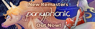
One of the great things about online fiction is that you don’t have to bow to traditional book-publishing styles. If you want a square cover, a horizontal cover or any other kind of cover, you can do it. Here are some great horizontal covers:


And here are a few square(ish) ones!


As you can see from everything we’ve talked about, you can approach cover art from a thousand different directions, depending on your time, your finances, your skill, your tastes and a ton of other things.
More than anything though, this post is to give you ideas on just how you can grab people’s attention. After all, when all that’s said and done… I think it’s always worth it to do it right and do it with style.
I’ll see you all next time on Writer’s Ways!
-Novel Idea

